

A PROJECT THAT PUSHED DESIGN INTO DELIVERY.
FROM CONCEPT TO CAMPAIGN.
FROM CONCEPT TO CAMPAIGN.
A Blandford Street project commissioned by Sunderland Business Improvement District.
Designing visibility. Building recognition. A place based identity system reframing the charity sector as a vital and visible force in city regeneration.
Designing visibility. Building recognition. A place based identity system reframing the charity sector as a vital and visible force in city regeneration.
Shifting perception. Inviting engagement.
FOR CONTEXT, INTENTION, AND PROCESS.
Before the branding shift.
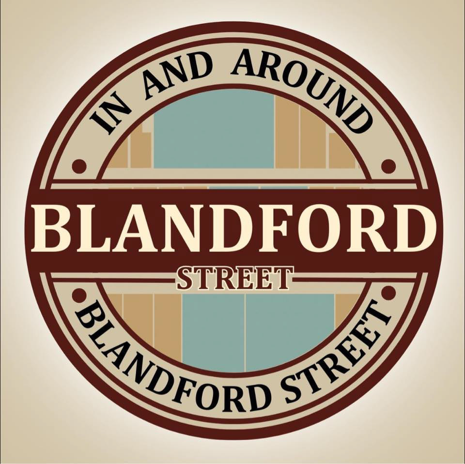
we inherited two logos. No cohesion. Blandford Street needed more than a badge. it needed a bold, unifying identity that could connect, inspire, and last.
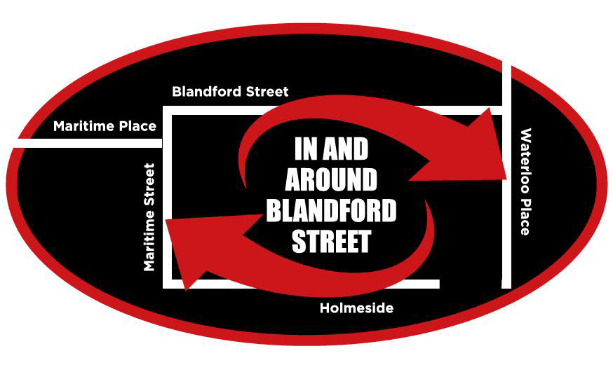
Blandford St identity:
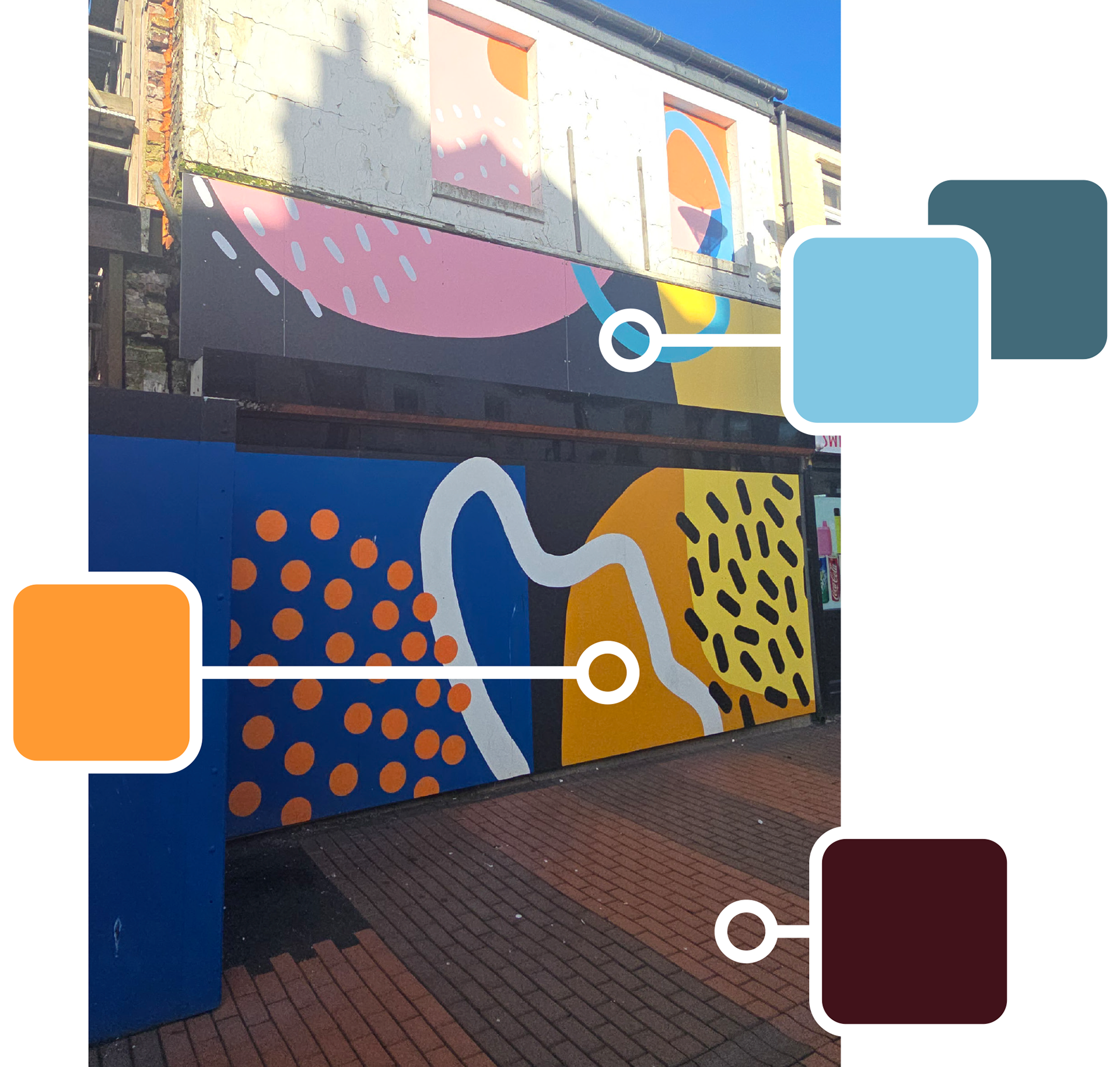
the palette
Inspired by Sea, Sun, Jewellery & Pathways. a mural by Future Walls Sunderland.
A reflection of local regeneration and re-emerging vibrancy.
A reflection of local regeneration and re-emerging vibrancy.
The palette also draws tonal cues from one of the original logos we inherited.
This wasn’t about starting from scratch, but building on what already existed.
We were asked to retain recognisable elements, especially the icon shape.
and, so the final identity balances familiarity and boldness, legacy and progression.
Its colours now signal a shared hope for a brighter, better future. rooted in the past, designed for what’s next.
The ICon:
Adapted into a location marker. Subtle shift in form, bold shift in meaning. Blandford Street is now a destination.


THE WORDMARK.
Sharp. Modular. Purposeful. It draws visual cues from pathway systems. signalling movement, routes, and connection. all in reference to blandford street. and its new beginning.


This project isn’t just about rebranding.
It’s about revaluing.
By reframing charity retail as a cultural asset, the Blandford St identity helps reshape how people see their high street. not as something lost, but as something evolving. with design as a driver of visibility, pride, and participation.
TO See THE IDENTITY COME TO LIFE.